Bode Plot
Interference frequencies and useful frequencies can take very small or very large values. We consider frequencies of a few hertz (Hz) and others of many megahertz (MHz). So we also consider angular frequencies ω = 2πf in the range from ω = 1 1/s up to ω = 1 M 1/s. To show these in one diagram at the same time, we use a logarithmic frequency axis. On this axis, the frequency increases by a factor of 10 from one vertical line to the next. With linear axes, in the example, +10 is added from one line to the next. With the logarithmic frequency axis, we can show larger frequency ranges in one diagram.
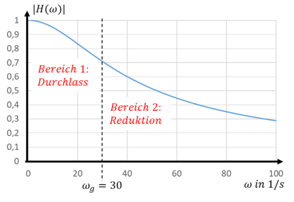
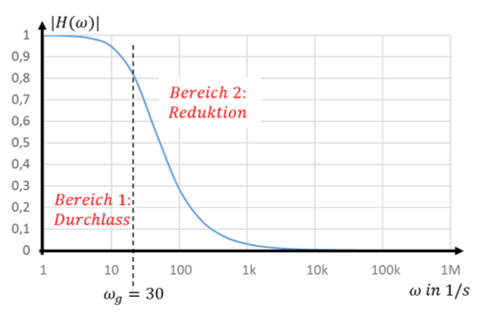
The magnitude of the transfer function is now shown for a much wider frequency range, from ω = 1 1/s to ω = 1 M 1/s. However, the transfer function of the filter can no longer be read off at very high frequencies ω > 10000 1/s. The y-values are too small. In the plot of frequencies in the range ω = [0 … 100 1/s] this was not noticeable; there the y-values simply were not that small.
To still be able to distinguish tiny values from 0, we also change the y-axis to a logarithmic scale. Here the axis value increases by a factor of 10 between two horizontal lines instead of by +0.1 as before. The same transfer function then looks like this:
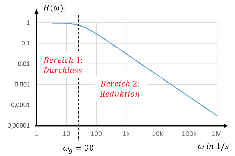
In this form of representation, we can visualise very small transfer function values over a very wide frequency range. Transfer functions of filters are usually shown in this log-log representation. In this representation you can also see better why the cut-off frequency divides the transfer function into two ranges. To the left of the cut-off frequency, the magnitude of the transfer function is approximately 1. To the right of the cut-off frequency, the magnitude of the transfer function falls as a straight line.
Actually, the transfer function decreases over frequency with the behaviour H ~ 1/f. In the log-log representation, this behaviour looks like a straight line. That is easier for our brain to process. We can read values more easily and draw it more easily. Keep in mind that this is only a graphical trick that only works in the log-log representation. The behaviour is not linear; it only looks that way.
This log-log diagram of transfer function and angular frequency is called a “Bode plot”.
Bode approximation
The filter already attenuates a signal at the cut-off frequency by a factor of 0.7. The attenuation at frequencies near the corner frequency is difficult to calculate. Far to the left of it, the transfer function is constantly 1; far to the right, it falls with a constant slope. Both are mathematically manageable.
At the cut-off frequency we use the Bode approximation as a simplification. We pretend that the transfer function is always 1 at frequencies less than or equal to the cut-off frequency. At frequencies above the cut-off frequency, it would fall directly with a constant slope. That would look roughly like this:
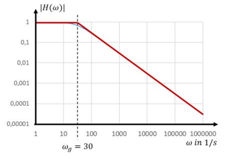
In red you see the curve of the transfer function according to the Bode approximation. In blue underneath you see the real curve. With the Bode approximation we only make an error around the cut-off frequency. Otherwise the two curves are almost identical. Since we will avoid the range around the cut-off frequency later anyway, from now on we will use this approximation for mathematical simplification.
To the right of the cut-off frequency, the following applies:
From now on, the Bode plot of the transfer function consists of only 2 straight lines. Compare it with the first version with linear axes. This makes working with it much easier. We can read off directly how the filter changes the input signals. Choose the angular frequency of the input signal on the x-axis. Read off the corresponding magnitude of the transfer function on the y-axis. The peak value of the signal is multiplied by this factor. This is much easier than evaluating the formula of the transfer function for the ω of the signal.